At the beginning of this project I met up with my group
consisting of : Kuan, Noah and Jess. We discussed concepts in the library of
how we would interweave our contributions/animated styles within the project.
After a few discussions of concept ideas such as apocalyptic
themes of sci-fi research of pre 1940s sci-fi films such as the old films and
magazines including of "Astounding" and "Metropolis". We
then agreed we wanted the tilte sequence to represent a book the way we would
transition from one scene to another, there would be a pair of hands move the
book onto the camera's birds eye view perspective.
We then agreed the book would be at centre stage, the hands
would open the book and the page would fade to the next image of concept or
animation and the next page would come to life.
Our group felt this would be a good way of expressing
imagination of a traditional interpretation of traditional sci-fi.
We also agreed we wanted all our contributions to the project
to be in black and white so there would be a constant theme of style. After
this group meeting we agreed to do our own personal research and show our
storyboards at the next meeting. I started off with gathering a number of book/movie images
to put into a mood-board to inspire my association of themes in terms of
typography and shapes within the graphics. I then selected which posters I wanted to illustrate. I felt
drawing some of the concepts would allow me to gain an idea of what style my
title sequence concept would appear like in terms of line work and how I would
respond to them in terms of colour.

The concepts I took inspiration from was the "green
helmet/alien type poster from one of the metropolis covers combined with an
image of Saturn from astounding and a clock like women again from a metropolis
cover. The next illustration was an illustration of a red alien women with claw
like hands from the cover of "The astounding she monster" cover.
Finally I then then illustrated my own interpretation of "The Billionaire
fantasia" cover. The way I created all these illustrations was by drawing a
rough outimes and then painting in the colour with watercolour paint. Once the
paint dried I drew on the outlines.
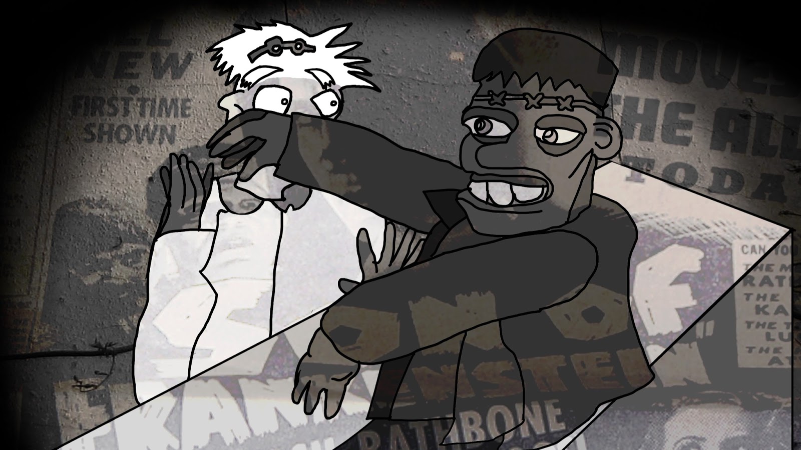
I replaced the faces with the cartoon of Frankenstein within the sketches. I also adjusted the mouth and eyes on Doctor Frankenstein. The rough sketches were for a rough idea of how the movement would appear. After I finished the sketches I then imported them into Photoshop I drew the outlines of the first scene reference and separated them into a separate folder. Afterward I then added colouring. For each scene there was a scene folder 1,2,3,4,5 organized. Mid way through scene 3 I added a texture background of a warehouse to see the general aestehetic would appear.
The bottom layer was a folder called construction lines and
I’d trace over them with scene 1,2,3,4 etc. After creating each scene outline I
would then add the colour and finally editing them to the same percentage of
saturation (grayscale). I decided to colour them in as I found it to interpret
the tone better. After the of frames I handed my contribution to Kuan who was
to edit everyone’s parts together.
The next stage was another group meeting. Kuan had created
in animatic which included a number of scifi concepts we had discussed. For
example, a rocket taking off, an alien apocalypse and Frankenstein. Each of us
watched the animatic and agreed which parts of the animatic. After the filming
of the live action book opening we set on our individual projects. We decided
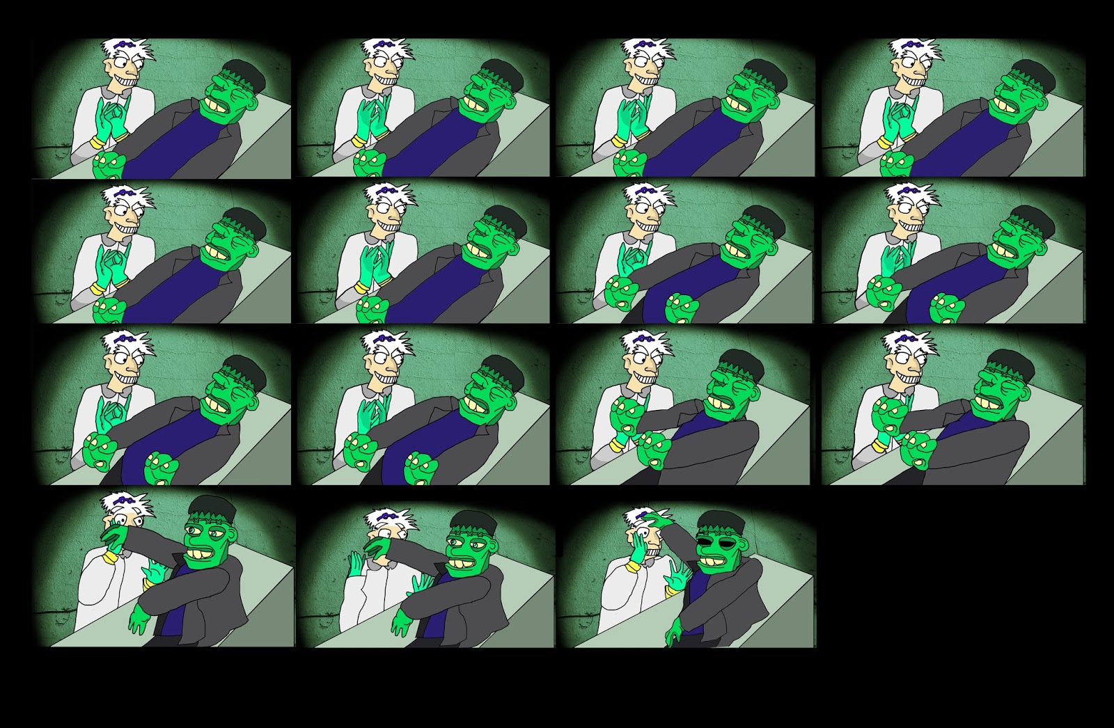
our animations would be 7 seconds each. I agreed to do the Frankenstein
animation. To prepare for my animation I created research page of films where
Doctor Frankenstein reanimates Frankenstein the monster. I also found some quirky
cartoon versions of a mad scientist and the monster Frankenstein.


After I finished the sketches I then imported them into
Photoshop I drew the outlines of the first scene reference and separated them
into a separate folder. Afterward I then added colouring. For each scene there
was a scene folder 1,2,3,4,5 organized. Mid way through scene 3 I added a
texture background of a warehouse to see the general aestehetic would appear. The bottom layer was a folder called
construction lines and I’d trace over them with scene 1,2,3,4 etc. After
creating each scene outline I would then add the colour and finally editing
them to the same percentage of saturation (grayscale). I decided to colour them
in as I found it to interpret the tone better. After the of frames I handed my
contribution to Kuan who was to edit everyone’s parts together.
Successes/Improvements of this project. I found overall my
contribution aesthetically pleasing in terms of a more graphical textured, line
and shape puppet animation rather than fluent movement. Some of the proportions
went a bit out of shape when the arms started to wave in “being brought to life”.
However, I was fond of the quirky aesthetic. To improve the movement I would
add in more keyframes for a solid/more fluent movement. Furthermore, I feel I
could have contributed with painting digital stary backgrounds/typography/creating
s digital storyboards/stopmotion typography if given more time as I had some
ideas. However, overall I felt the group dynamic was good, the group was open
minded to each others ideas and fond of the genre of title and concepts, everyone
focussed on their own concept and tried to interweave the ideas for one style
so it was clear it was a group collaboration.